
11 Instagram Feed Ideas That Instantly Boost Your Aesthetic
September 10, 2025
You know that moment when you land on someone’s Instagram profile and just… stop scrolling? Something about their feed feels polished, cohesive, almost like a mini-magazine.
That’s not an accident. It’s design.
The truth is, people don’t just follow you for what you say. They follow you for how your profile feels. And your feed is the first impression.
If you’ve ever thought, “My posts are fine, but my grid doesn’t look pulled together,” this guide is for you. Here are 11 Instagram feed ideas that will instantly boost your aesthetic and make people want to stick around.
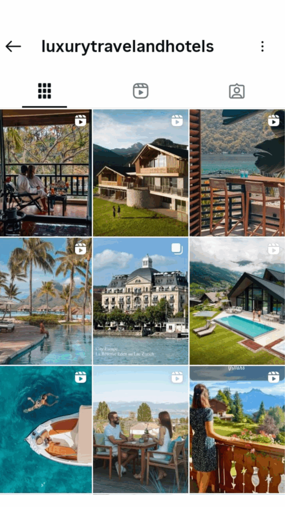
1. Color-Coordinated Theme
Ever noticed how a pastel-themed profile feels calming, while a neon-heavy one feels bold and energetic? That’s color psychology at play.
Why it works: Colors don’t just look pretty. They create emotion and memory.
How to do it: Choose 2–3 brand colors. Use them in outfits, props, backgrounds, or text graphics. Tools like Canva’s palette generator make it simple.
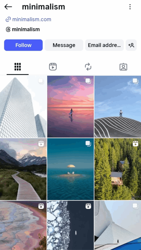
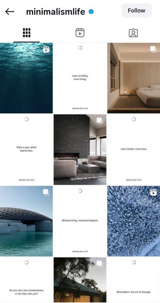
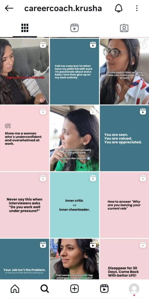
2. Minimalist Feed
Imagine scrolling through a feed where every post breathes. No clutter, no chaos. Just clean lines and calm energy.
Why it works: A minimalist feed gives off a polished, professional vibe.
How to do it: Think neutral backdrops, simple fonts, and space. Resist the urge to overload each post with elements.
3. Puzzle Layout
Have you seen a grid where each post is a piece of a bigger picture? That’s the puzzle feed. It’s like unwrapping a visual story one square at a time.
Why it works: It grabs attention the second someone visits your profile.
How to do it: Tools like Planoly or Preview split your design into 6-9 squares. The trick is to make sure each piece looks good individually and as part of the whole.
4. Checkerboard Grid
Picture a chessboard: black, white, black, white. Now imagine your Instagram doing the same- photo, quote, photo, quote.
Why it works: It creates instant rhythm and makes your feed feel intentional.
How to do it: Pick two styles (e.g., lifestyle photos + branded graphics). Post them in rotation so your grid stays balanced.
5. UGC (User-Generated Content) Style
Here’s a secret: your community can help build your aesthetic.
Why it works: Featuring your followers makes your brand feel approachable and trustworthy. It’s social proof built into your feed.
How to do it: Encourage tags or branded hashtags. Repost customer photos, edit them slightly to match your palette, and mix them into your grid.
6. Rainbow Rows
Scrolling from pink → orange → blue across a grid is oddly satisfying, isn’t it? That’s the rainbow row strategy.
Why it works: It’s playful and instantly memorable.
How to do it: Plan your posts in rows of three. Each row = one color. Then transition to the next shade for a striking gradient effect.
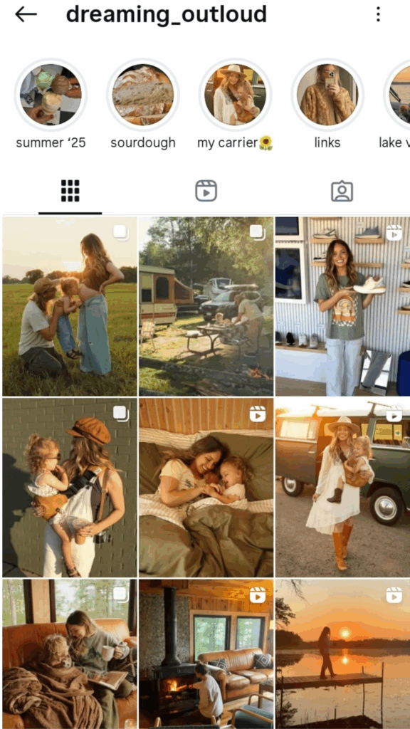
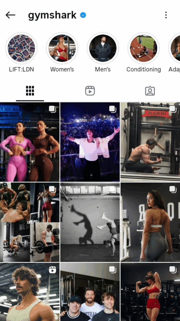
7. Lifestyle Collage
Nobody wants to follow a sales pitch. They want a story.
Why it works: Mixing brand content with personal lifestyle shots humanizes your feed. It shows the life behind the product.
How to do it: Post a mix of daily routines, behind-the-scenes, and polished product shots. Think of your feed as a scrapbook rather than a billboard.
8. Seasonal & Trend-Based Aesthetic
Trends shape what feels “fresh.” In 2025, for example, green feeds are everywhere, symbolizing wellness and sustainability.
Why it works: When you align with current aesthetics, your content feels relevant and timely.
How to do it: Add trending colors, props, or filters into your visuals. Just keep your brand identity as the base layer.

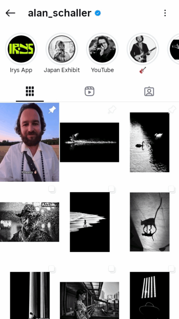
9. Black & White Contrast
If you want to stand out in a sea of colorful feeds, go monochrome.
Why it works: Black and white instantly creates drama and focus. Adding the occasional pop of color makes it even more powerful.
How to do it: Stick to high-contrast edits. Post one or two color shots sparingly for maximum impact.
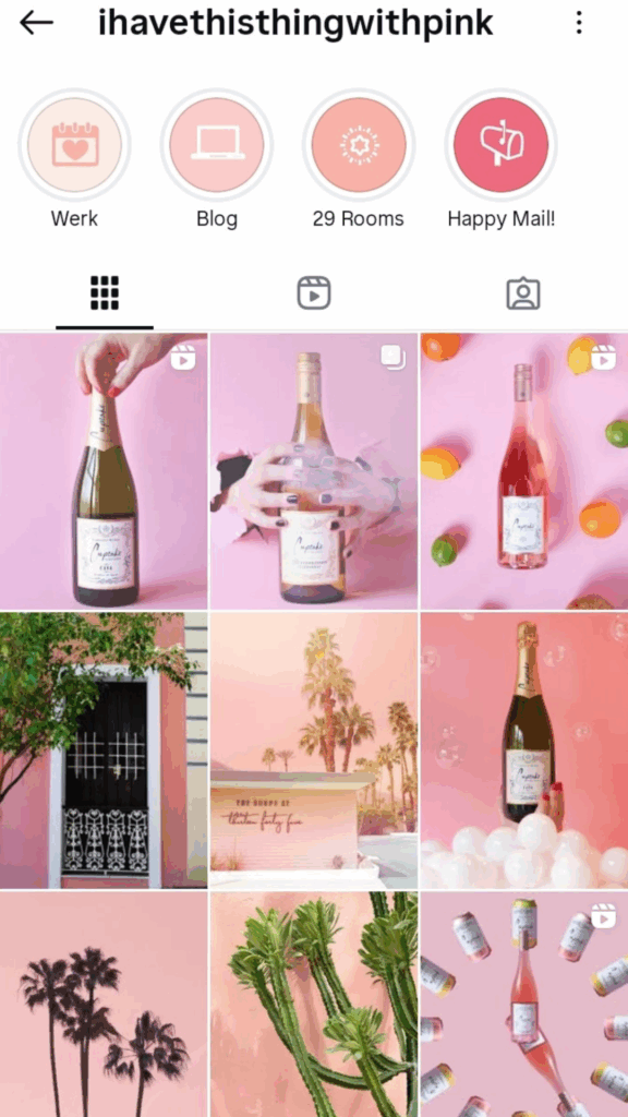
10. Pink Aesthetic Feed
A grid drenched in blush and rose tones feels soft, playful, and instantly eye-catching.
Why it works: Pink creates warmth and charm while keeping your feed cohesive.
How to do it: Stick to 2–3 pink shades. Balance with neutrals so it doesn’t overwhelm.
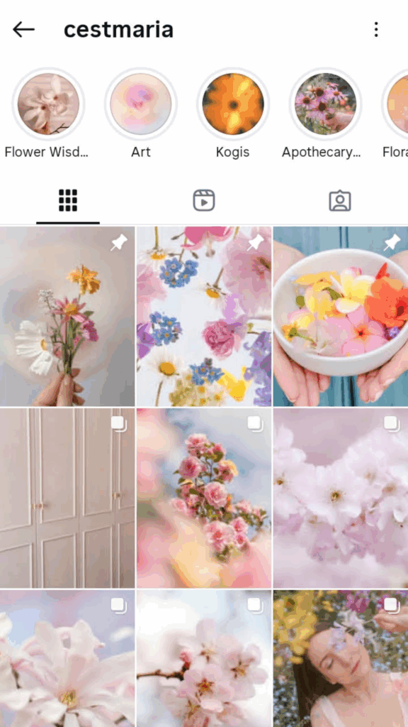
11. Pastel Aesthetic Feed
Think airy blues, mint greens, and lilacs—a grid that feels calm and light.
Why it works: Pastels are soothing, approachable, and memorable.
How to do it: Use pastel props, outfits, or edits. Tone down harsh colors with filters.
Your Instagram feed is more than decoration- it’s an invitation. It tells new visitors who you are before they read a single caption.
You don’t need fancy tools or a designer’s eye. You just need clarity, consistency, and a style that feels true to your brand.
Start small. Pick one idea from this list and try it for the next 9–12 posts. Watch how your grid transforms.
Check out the weekly content calendar– it’s packed with ready-to-use ideas so you never run out of content.
And if you want daily inspiration, come hang out with us on Instagram. We’ll help you turn your feed into a scroll-stopper.


