19 Creative Instagram Feed Ideas for a Cohesive Aesthetic
February 27, 2026
If someone opens your Instagram profile today, what do they see?
Before they read your bio, before they watch a reel, before they decide whether to follow you, they scroll through your feed. In those first few seconds, your grid silently answers one question for them: does this account feel clear and intentional?
A cohesive Instagram feed is not about making every post identical. It is about creating visual continuity. When your feed flows well, people trust your brand faster, stay longer on your profile, and understand what you are about without effort.
In this blog, we will walk through 21 creative Instagram feed ideas that are both trending and result-driven. These ideas focus entirely on the visual structure of your grid, how posts sit next to each other, and how your overall aesthetic comes together over time.
What does a cohesive Instagram feed actually mean?
A cohesive Instagram feed is one where posts feel connected when viewed together. This connection can come from repeating colors, consistent layouts, similar photography styles, or a clear visual rhythm across rows and columns.
When a feed lacks cohesion, posts may look good individually but feel chaotic as a group. This usually happens when design decisions change too often or when there is no visual system in place.
A cohesive feed helps you create familiarity. Over time, people begin to recognize your content even before they see your name.
21 Creative Instagram Feed Ideas for a Cohesive Aesthetic
1. Checkerboard feed
A checkerboard feed alternates between two types of posts across the grid. When someone scrolls your profile, they see a balanced back-and-forth pattern rather than similar posts clumped together.
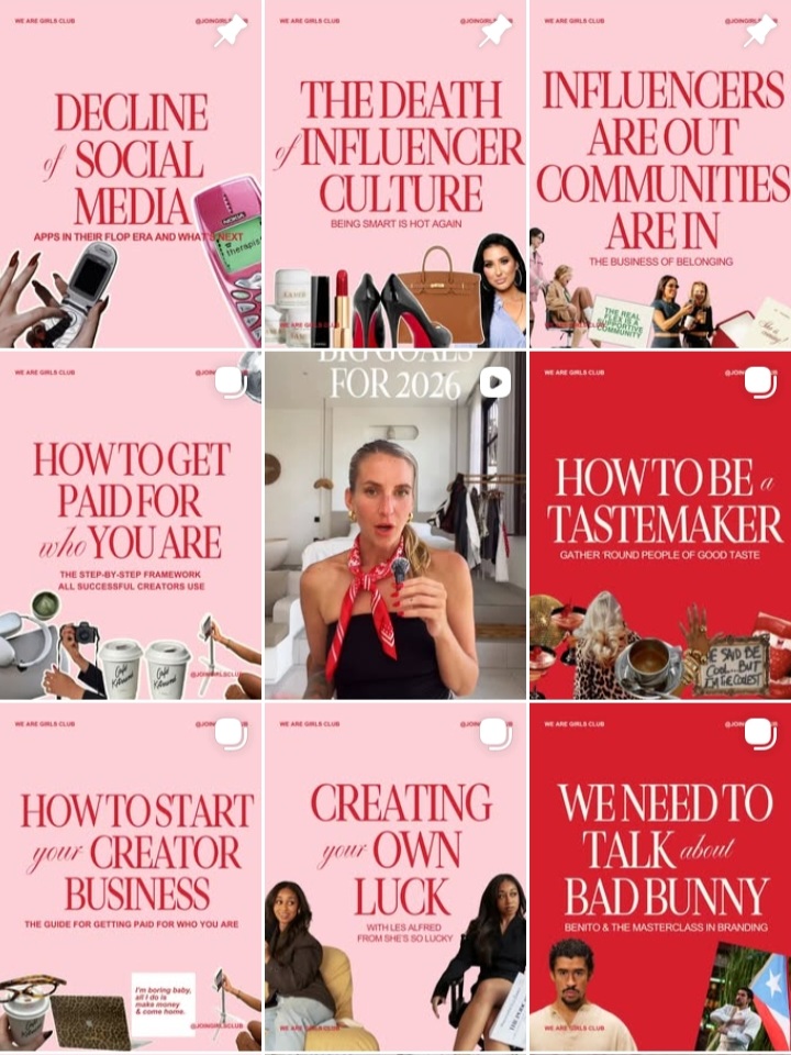
This style works well when you want to mix educational content with visuals. For example, you might alternate quote-based posts in your brand colors with lifestyle images or product photos. The contrast keeps the feed visually engaging while still feeling structured.
2. Row-by-row themed feed
In a row-based feed, each horizontal row of three posts follows a single theme. When someone views your grid, every row feels like a complete visual story.
You could use one row for tips, the next for testimonials, and another for behind-the-scenes content. This approach is especially useful for brands that post different content types but want clear separation without visual clutter.
3. Color-blocked rows
Color-blocked rows use one dominant background color per row. As you scroll, the feed looks organized and visually soothing.
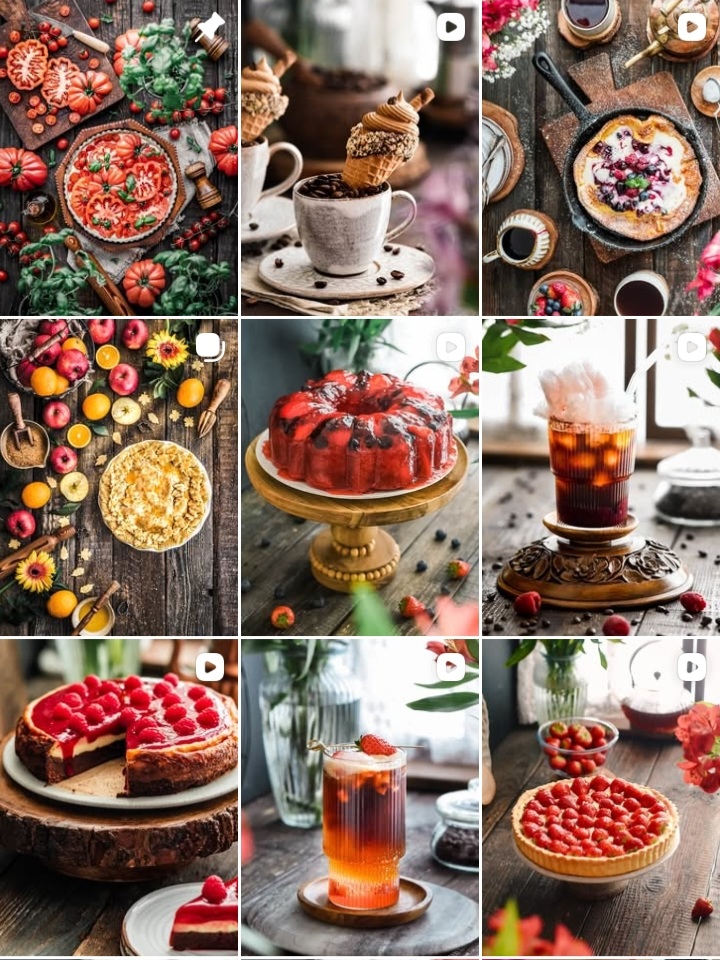
For example, one row may use warm beige tones, the next muted greens, and the next soft browns. This idea works best for minimal or aesthetic-driven brands that want their feed to feel calm and intentional.
4. Consistent carousel cover feed
With this feed idea, every carousel post follows the same cover design. The font size, text placement, and background style remain consistent across posts.
When multiple carousel covers appear next to each other on the grid, they create a clean and professional look. This style is highly effective for educators and service-based brands that rely on carousel content.
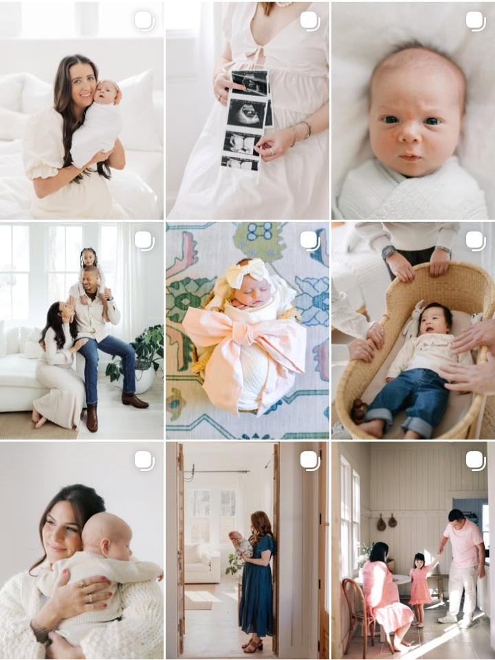
5. Minimal white-space feed
A white-space-heavy feed uses breathing room intentionally. Posts feature clean backgrounds, limited text, and soft visuals.
This feed style feels calm and premium when done consistently. It works well for wellness brands, personal brands, and creators who want their content to feel uncluttered and thoughtful.
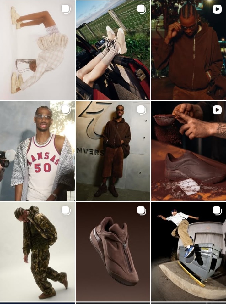
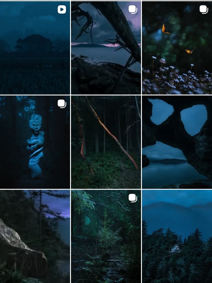
6. Dark-tone aesthetic feed
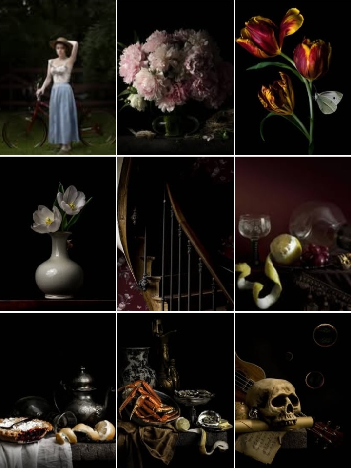
Dark-tone feeds rely on deep backgrounds paired with light text or highlights. When used consistently, this style creates a bold and dramatic mood.
Charcoal, deep brown, or muted black backgrounds can give your feed a premium feel. The key is consistency in tone so the grid feels intentional rather than heavy.
7. Soft pastel feed
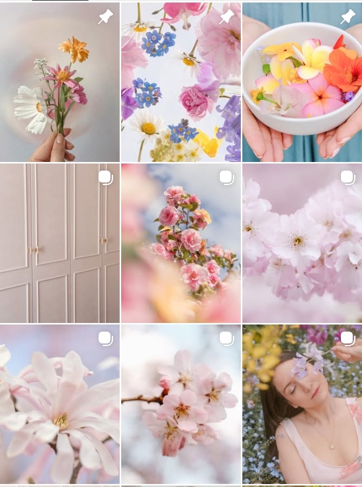
Pastel feeds use light, muted colors that feel gentle and inviting. The visual softness makes scrolling feel easy on the eyes.
This feed idea works well for lifestyle, beauty, and creative brands that want an approachable and friendly aesthetic.
8. Repeating frame or border style
Adding a subtle frame or border to every post creates instant cohesion. Even when images vary, the frame acts as a visual anchor.
This works well for brands that use diverse visuals but want a unifying element.
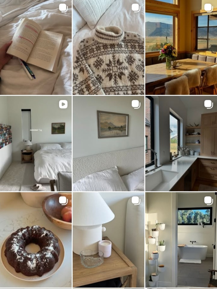
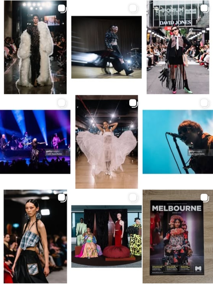
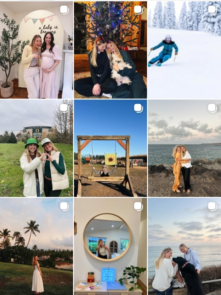
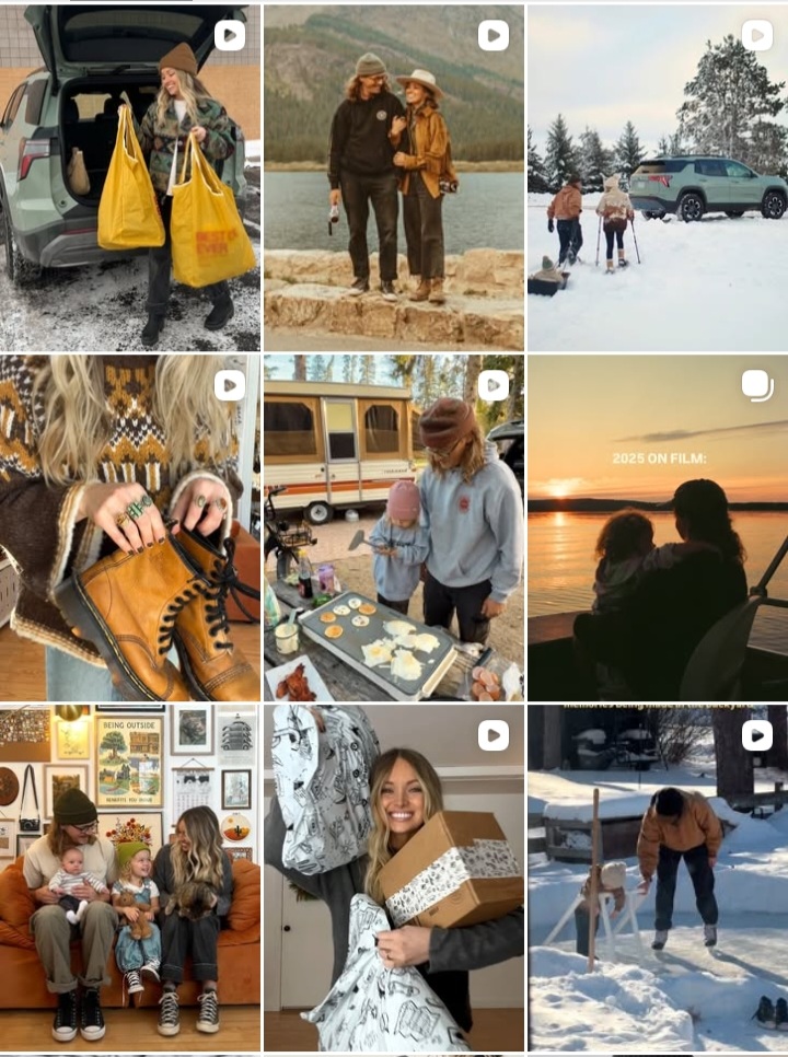
9. Lifestyle photography-only feed
This feed uses real-life images with consistent lighting and tones. There are no graphics or text overlays.
When done well, this style feels authentic and warm. It suits creators who want to build personal connections visually.
10. Seasonal aesthetic feed
A seasonal feed evolves slowly throughout the year while maintaining the same layout structure.
Colors and visuals shift with seasons, but the underlying design system stays the same, keeping the feed cohesive.
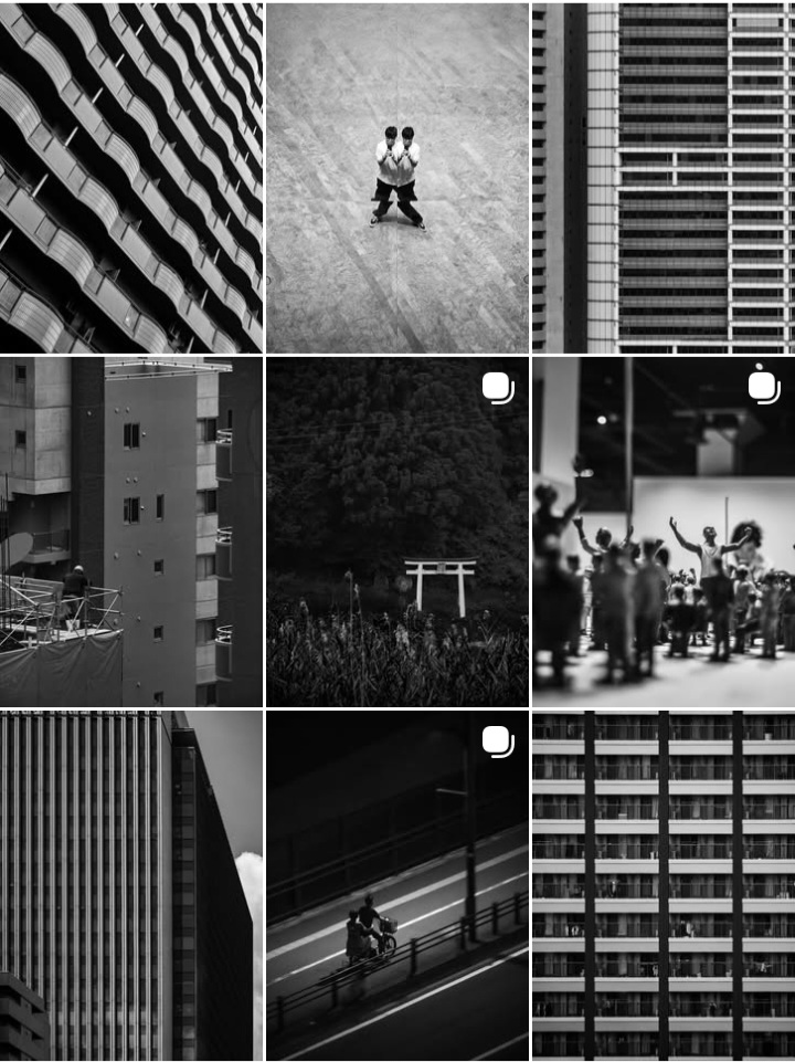
11. Monochrome feed
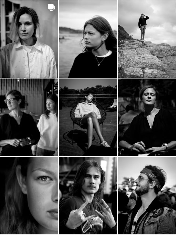
A monochrome feed uses one main color in different shades. The variation keeps the feed interesting without visual chaos.
This approach works well for brands that want simplicity without looking repetitive.
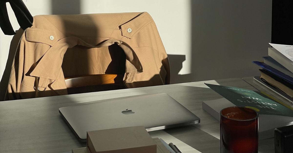
12. Flat-lay focused grid
Flat-lay feeds use top-down photography, meaning every image is shot from directly above. This creates a clean, organized look because the angle stays consistent across the grid.
Items like notebooks, coffee mugs, laptops, products, or work desks are commonly used in this format. When the camera angle remains the same, the feed feels visually steady and easy to scroll, even if the objects in each post change.
13. Product-focused feed
A product-focused feed is built around showcasing your product as the main visual element on the grid. Every post clearly features what you sell, whether it’s a physical product, a digital product, or a service represented visually.
Instead of random lifestyle images, the grid stays consistent through similar backgrounds, angles, and framing.
For example, skincare brands often photograph products on neutral surfaces, fashion brands repeat outfit shots, and digital creators consistently show mockups of templates or work previews.
This feed style works especially well for ecommerce brands and service providers because visitors immediately understand what the account is about without scrolling too much.
14. Same filter feed
A same filter feed uses one consistent photo filter or preset across all images. The composition and subject may change, but the overall tone of the grid stays unified because the lighting and colors feel the same.
This style is common among lifestyle creators, travel accounts, and personal brands who post real photos but want their feed to look polished and intentional.
By using the same preset in apps like Lightroom, the grid looks cohesive even when images are taken at different times or locations.
It’s a low-effort way to create consistency without designing graphics for every post.
15. Puzzle grid theme
A puzzle grid theme is a layout where multiple posts connect visually to form one larger image or design across the grid. When viewed individually, each post may look incomplete, but together they create a full picture or message.
This feed style is often used during launches, campaigns, or announcements. Brands might use it to reveal a new collection, share a big message, or create visual drama on their profile.
While eye-catching, puzzle grids require careful planning because individual posts may not perform as well on their own.
16. Color-coordinated theme
A color-coordinated theme focuses on maintaining a consistent color palette across the entire feed. Posts may vary in format, but the colors stay within a defined range.
For example, a brand might stick to beige, brown, and white, or alternate between two brand colors across the grid. This makes the feed visually pleasing and easy to recognize.
This theme is widely used by brands that want flexibility in content types while still maintaining a strong visual identity.
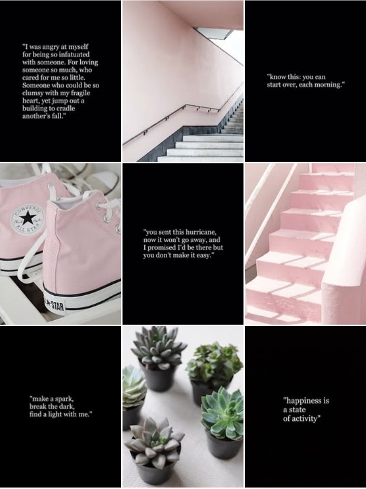
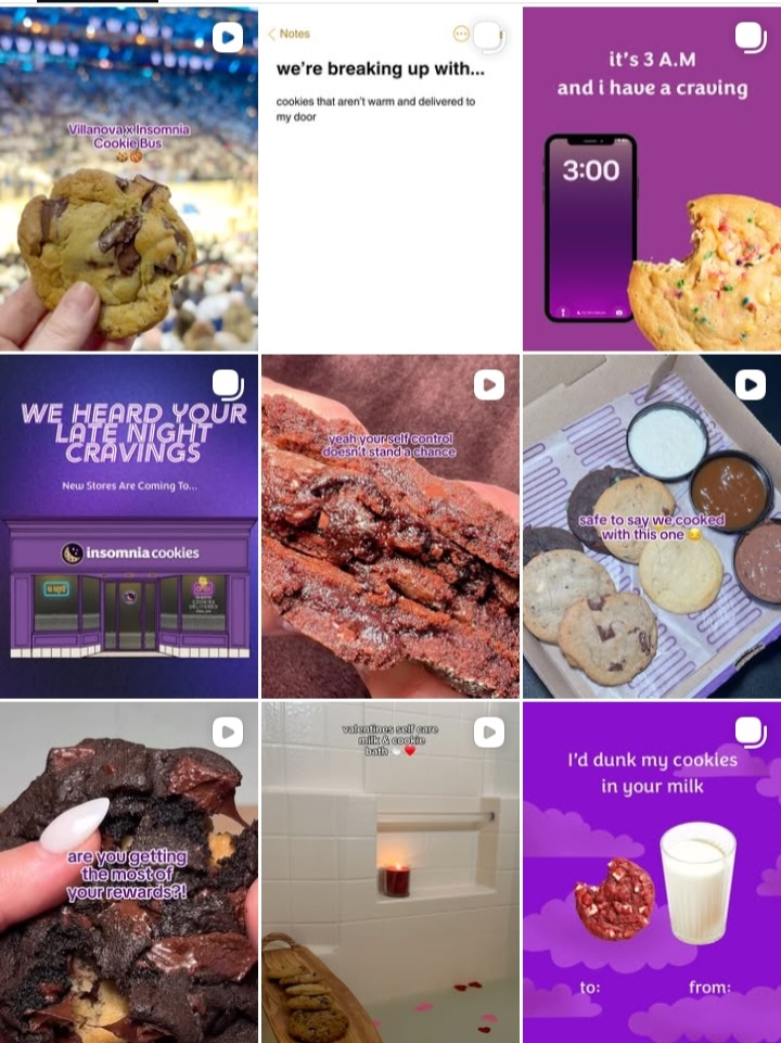
17. Pink theme
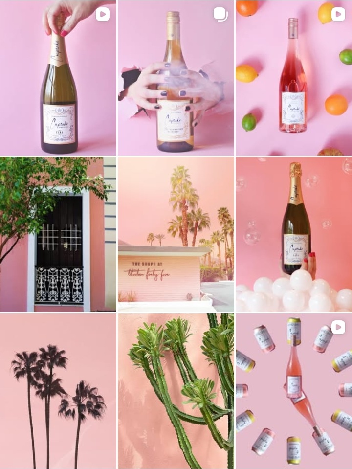
A pink theme is a specific color-based feed where pink dominates the grid. Shades may vary from soft blush to bold fuchsia, but the core color remains consistent.
This theme is popular among beauty brands, fashion creators, and lifestyle accounts because pink naturally creates a warm, playful, and visually striking grid.
When done well, the feed looks cohesive even if the content format changes, because the color acts as the unifying element.
18. Blue theme
A blue theme uses shades of blue across the grid, ranging from light sky blue to deep navy. This theme often creates a calm, clean, or professional feel.
Many tech brands, wellness pages, and personal brands use blue-toned feeds to communicate trust and clarity. The consistency usually comes from backgrounds, clothing, graphics, or image filters.
As with other color themes, success depends on sticking to the same tonal family instead of mixing random shades.
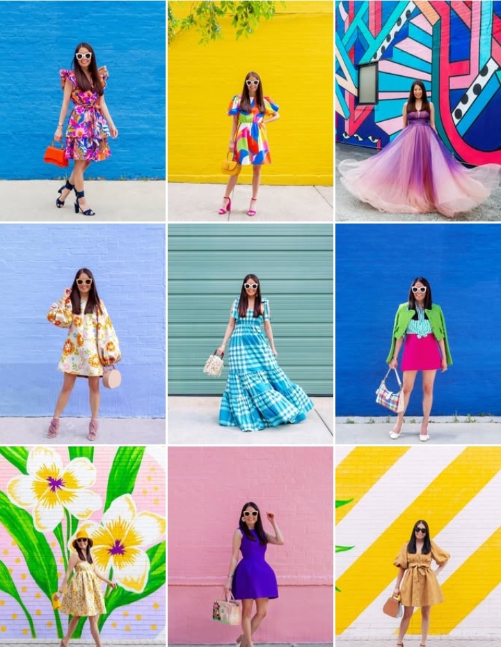
19. Bold and vibrant feed
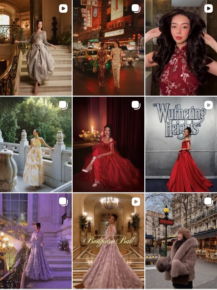
A bold and vibrant feed uses bright colors, high contrast, and strong visuals to stand out instantly. Posts often feature saturated colors, large text, or striking imagery.
This style is commonly used by creators, coaches, and brands that want to grab attention quickly in a crowded feed. Consistency usually comes from repeating color intensity, typography, or graphic style.
When used thoughtfully, this feed style helps profiles look energetic and memorable without feeling chaotic.
Bonus: Contextual theme
A contextual theme is built around relevance rather than strict visuals. The feed changes visually based on the context, such as seasons, campaigns, launches, or current topics, while still following some underlying consistency.
For example, a brand may switch visuals during festivals, sales periods, or awareness months but keep fonts, layouts, or framing consistent.
This approach works well for brands that want flexibility while still looking intentional and timely.
Final thoughts on building a cohesive Instagram feed
A cohesive Instagram feed is built through thoughtful repetition, not constant redesigns. When your grid feels visually clear, people understand your brand faster and stay longer on your profile.
Choose one or two feed ideas that align with your current goals and feel realistic for you to maintain. Apply them consistently, review your grid monthly, and let your aesthetic evolve naturally as your goals grow and shift over time.
Check out the weekly content calendar packed with plug-and-play templates and weekly prompts to help you turn these feed ideas into consistent, on-brand posts without starting from scratch each time.
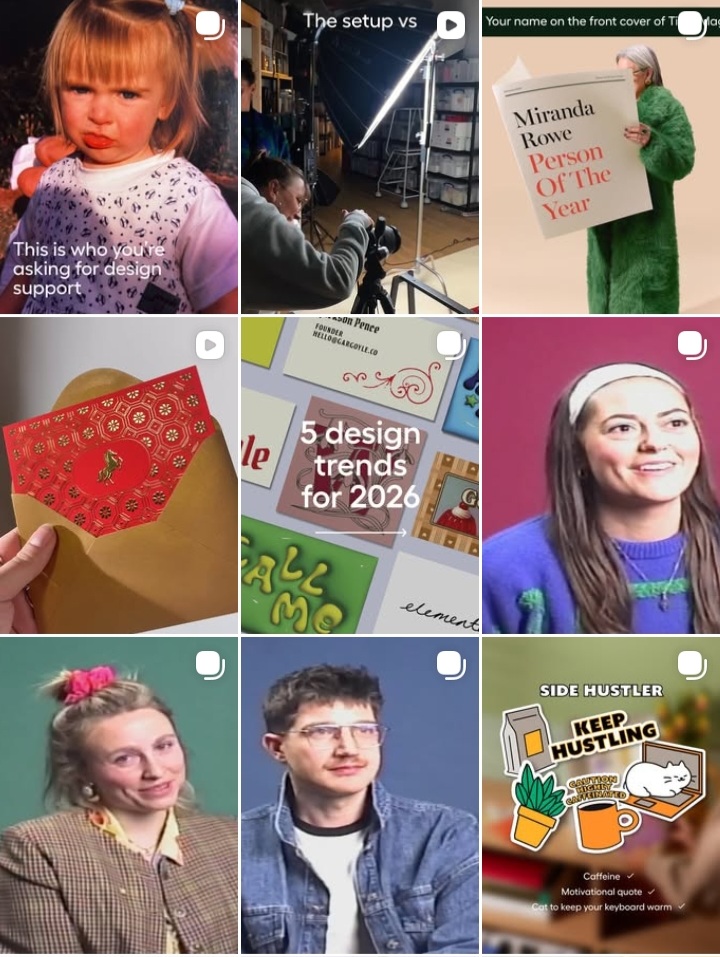
Follow us on Instagram for ongoing feed inspiration, trending grid ideas, and real examples that show how cohesive aesthetics actually look in practice.


